BRAND DESIGN
Café Vie
A flexible identity pairing expressive typography, food-inspired illustration, and a vibrant palette to create an energetic, approachable brand rooted in the social experience of Asian food.
Scope
Brand Design
Client
Café Vie
Industry
Food & Beverage
Duration
6 Weeks

Challenge
Create a distinctive café identity that stands apart from the minimal visual language common across contemporary Asian food brands.
Insight
The experience is shaped by more than the food itself. Color, movement, variety, and visual density create the energy that makes Café Vie feel vibrant and social.
Solution
A playful identity system built around custom food illustrations, bold color, expressive typography, and modular graphics designed to flex across physical and digital touchpoints.
The identity began with a hand-drawn logo system inspired by the movement, personality, and visual energy of Asian food culture.

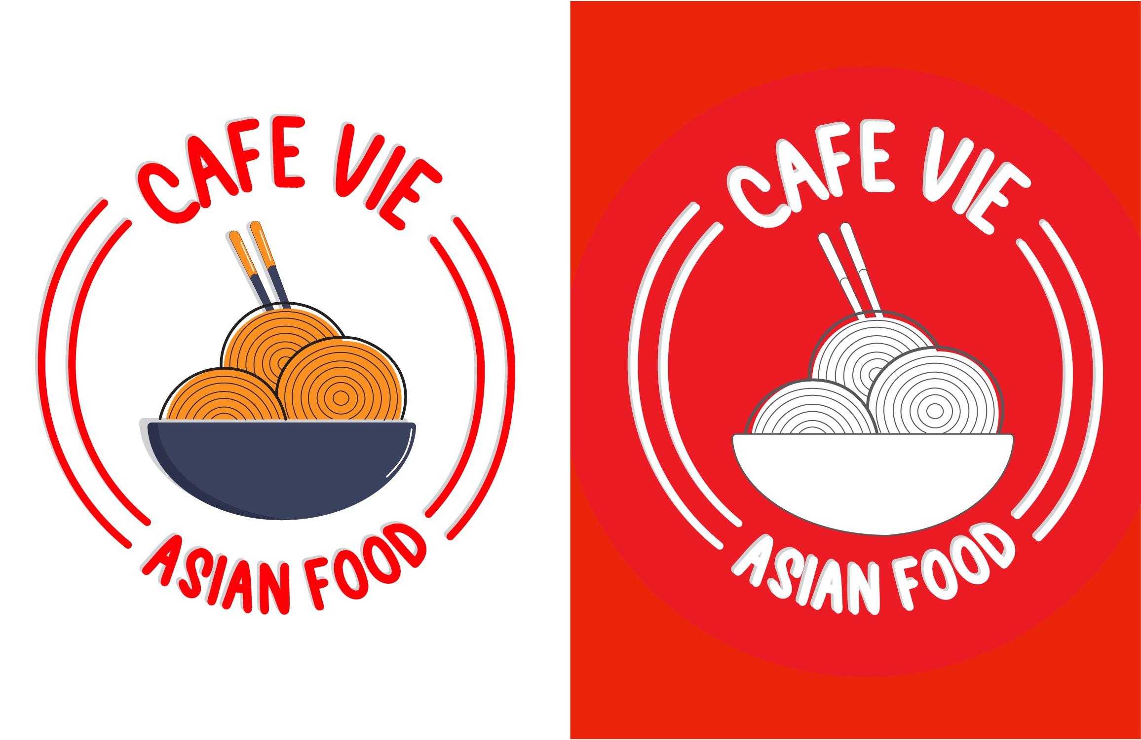

Custom food illustrations create a playful graphic language that extends across patterns, packaging, environmental graphics, and digital applications.


The identity scales across physical touchpoints, creating a consistent experience from storefront signage and packaging to menus and takeaway materials.


Café Vie demonstrates how a distinctive visual system can turn individual brand elements into a cohesive experience across physical and digital touchpoints. The flexible identity creates consistency while leaving room for playful, evolving brand expression.
EXPLORE MORE WORK

